|
|
首先展示一下整体的效果:
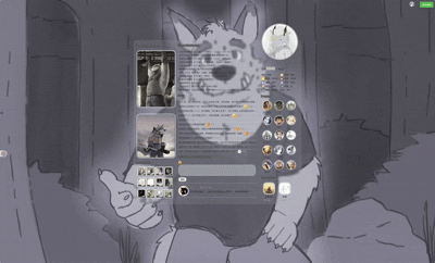
整个整体都采用了css代码,使用了大量的before、after、hover这些伪元素,部分设计会在后边展开讲解。
最后感谢@RaSharim 的部分代码协力以及脚本装修仓库,如果需要可前往超链接查看使用
我的空间令牌也会在文末附件附上。
对于这类非基于原本discuz论坛空间diy页面自定义的空间,主要分三步走;

1.xml框架的确定
首先你需要做的自行写好你的空间的框架xml代码,确定好空间的比例,有哪些模块,例如我的空间布局为1:2:1,那么主体框架就改为如下的代码:
- <root>
- <item id="diypage">
- <item id="frame`frame1">
- <item id="attr">
- <item id="name"><![CDATA[frame1]]></item>
- <item id="className"><![CDATA[frame cl]]></item>
- </item>
- <item id="column`frame1_left">
- <item id="attr">
- <item id="name"><![CDATA[frame1_left]]></item>
- <item id="className"><![CDATA[z column]]></item>
- </item>
- <item id="column`frame1_center">
- <item id="attr">
- <item id="name"><![CDATA[frame1_center]]></item>
- <item id="className"><![CDATA[z column]]></item>
- </item>
- <item id="column`frame1_right">
- <item id="attr">
- <item id="name"><![CDATA[frame1_right]]></item>
- <item id="className"><![CDATA[z column]]></item>
- </item>
- </item>
- </item>
- </item>
- </root>
当然,如果你实在头疼,直接食用装修仓库一键导出你需要的框架结构代码即可,省得自己写的晕头转向的
在获得你的框架xml代码后,随后在有评论框的地方(包括回帖框、记录评论框、留言板)使用注入代码附带你的xml代码就可是你的初始模样,例如我的空间原始样图:
对于空间布局的参考,你也可以查看如下的帖子:
1.【冬宫学府】【教程】进阶版泥潭个人空间Css代码装修技巧教程丨UI制作篇
2.【奇幻工坊】【空间模板】只需“三步”即可拥有同款空间
3.【花马金裘】【油猴脚本】一个更好用的保存空间及分享的脚本——装修仓库
2.css的编写 在成功导入xml框架之后,你的浏览器会提醒你输入css代码,此时点取消即可,此时你的空间就是默认的未装修状态。 接下来就是可长可短的css思考时间,这里以我的空间几个效果为例 ①头像上浮、翻转、上浮文字显示特效 一开始上浮特效我只是设计了简单的主体上移,但是很快测试就发现了,头像上移后无法显示完全全被截断,所以在这之前需要确保编写一段代码保证超区域限制显示: - #ct,
- #diypage,
- #frame1,
- #frame1_right,
- #frame1_center,
- #frame1_middle,
- #profile,
- #profile_center {
- overflow: visible !important;
- }
然后就是写一段让元素 .hm上移翻转的css代码 - #profile .hm {
- position: absolute !important;
- top: -150px !important;
- width: 200px !important;
- height: 200px !important;
- border-radius: 50% !important;
- overflow: hidden !important;
- perspective: 800px;
- border: 5px solid rgba(255,255,255,0.6) !important;
- }
- #profile .hm img {
- width: 100% !important;
- height: 100% !important;
- object-fit: cover !important;
- display: block !important;
- backface-visibility: hidden;
- transition: transform 0.8s ease;
- transform-style: preserve-3d;
- }
- #profile .hm:after {
- content: "";
- position: absolute;
- top: 0;
- left: 0;
- width: 100%;
- height: 100%;
- border-radius: 50%;
- background: url("https://i.postimg.cc/Hn6tbBYY/me-Tyson.png") center/cover no-repeat;
- transform: rotateY(-180deg);
- backface-visibility: hidden;
- transition: transform 0.8s ease;
- }
- #profile .hm:hover img {
- transform: rotateY(180deg);
- }
- #profile .hm:hover:after {
- transform: rotateY(0deg);
- }<i>
- </i>
以及设置上浮显示文字的css效果 - #profile::before {
- content: "Meine Liebste";
- position: absolute;
- top: -190px;
- left: 50%;
- transform: translateX(-50%);
- font-family: "Times New Roman", "Georgia", serif;
- font-size: 22px;
- font-weight: bold;
- font-style: italic;
- background: linear-gradient(90deg, #FFEBA6, #A6C4FF);
- -webkit-background-clip: text;
- -webkit-text-fill-color: transparent;
- opacity: 0;
- transition: opacity 0.6s ease, transform 0.6s ease;
- pointer-events: none;
- white-space: nowrap;
- }
- #profile:hover::before {
- opacity: 1;
- transform: translateX(-50%) translateY(-6px);
- }<b>
- </b>
②右侧区域互动效果 - #statistic {
- width: 230px !important;
- height: 130px !important;
- margin: 40px auto !important;
- position: relative;
- overflow: visible !important;
- }
- #statistic::before {
- content: "Vorbeiziehende und Punkte";
- position: absolute;
- top: 120%;
- right: -290px;
- transform: translateY(-50%) translateX(-20px) scaleX(0.8);
- font-family: "Times New Roman", "Georgia", serif;
- font-size: 22px;
- font-weight: bold !important;
- font-style: italic;
- letter-spacing: 1px;
- background: linear-gradient(90deg, #c9a23f, #f5d77a, #b8860b);
- -webkit-background-clip: text;
- -webkit-text-fill-color: transparent;
- opacity: 0;
- white-space: nowrap;
- transition:
- opacity 0.5s ease,
- transform 0.6s cubic-bezier(.22,1,.36,1);
- }
- #statistic:hover::before {
- opacity: 1;
- transform: translateY(-50%) translateX(0) scaleX(1);
- }
- #statistic::after {
- content: "";
- position: absolute;
- top: 50%;
- right: -140px;
- transform: translateY(-50%) rotate(-20deg);
- width: 140px;
- height: 140px;
- background: url("https://i.postimg.cc/5y7z3WgT/dave.png") no-repeat center/contain;
- opacity: 0;
- pointer-events: none;
- transition:
- opacity 0.5s ease,
- right 0.5s ease,
- transform 0.5s ease;
- }
- #statistic:hover::after {
- opacity: 1;
- right: -220px;
- transform: translateY(-50%) rotate(0deg);
- }<b>
- </b>
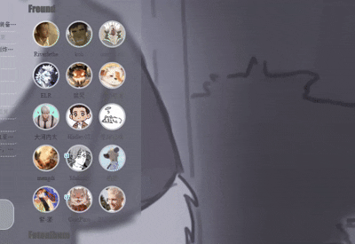
③好友头像旋转放大效果 - #friend .avt {
- width: 50px;
- height: 50px;
- border-radius: 50% !important;
- overflow: hidden !important;
- border: 3px solid rgba(255,255,255,0.6)!important;
- display: flex;
- align-items: center;
- justify-content: center;
- transition: transform 0.4s ease;
- }
- #friend .avt img {
- width: 100% !important;
- height: 100% !important;
- object-fit: cover !important;
- display: block !important;
- }
- #friend .avt:hover {
- transform: scale(1.08) rotate(-35deg);
- }<b>
- </b>
④文字的凸显和框选效果 - #thread_content li {
- width: 450px !important;
- height: 18px !important;
- margin: 2px auto !important;
- position: relative;
- border-radius: 5px;
- overflow: hidden;
- transition: all 0.4s ease;
- }
- #thread_content li:hover {
- background:rgba(131, 183, 218, 0.4);
- backdrop-filter: blur(5px);
- -webkit-backdrop-filter: blur(5px);
- font-size: 13px !important;
- font-weight: bold !important;
- transform: translateX(2px);
- }<b>
- </b>
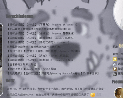
效果如下展示: 左栏图片放大内容和勋章效果参考这两篇帖子,需要的自取: 3.CSS的内容导入 在设计完你想要的元素的css效果之后。再次重复步骤1,然后这次把css内容复制进去,然后刷新页面即可大功告成啦。 如果你使用了我的装修令牌,那大致的效果就会如下: 尾言: 本次装修大概花了三四天,一是因为一开始被xml折磨了,后边用脚本解决了,二则是因为贪心不足蛇吞象,想要的效果太多了,导致越写越多,越删越多,最后删删改改才有了我个人最喜欢的PASSWORD主题互动元素。 另外大河内说的有道理,折腾这么多不如直接重新写网页设计UI,例如他的空间。 如果你对前端的设计也感兴趣,可以去看看菜鸟教程上的css内容,至少讲得很清楚。我也是看了很久才看会了一些。部分内容也得问问gpt调教一下。 最后附上我的空间框架、自由模块内容、和整体的css代码,如有需要同款,也欢迎使用令牌一键导入~ 最后的最后难得求点追随和血液~ 祝开年工作顺利。
|
本帖子中包含更多资源
您需要 登录 才可以下载或查看,没有账号?立即注册
x
评分
-
查看全部评分
|


 [复制链接]
|关注本帖
[复制链接]
|关注本帖

 /1
/1 
 GameMale
 金币
金币 血液
血液 旅程
旅程 追随
追随 知识
知识 咒术
咒术 堕落
堕落 灵魂
灵魂 主题
主题 回帖
回帖 日志
日志 精华
精华 好友
好友 积分
积分
 游侠 · I


 楼主
楼主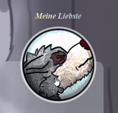

 提升泵
提升泵 亮色刷
亮色刷 小时顶
小时顶


 ,我也来学习学习一下如何装修
![霉运小精灵[红]](https://img.gamemale.com/album/202606/09/023747o34vdyv28myyoxmo.gif)


 我没有一点编程经验